
-
Design Direction: Earth Tones and Materiality
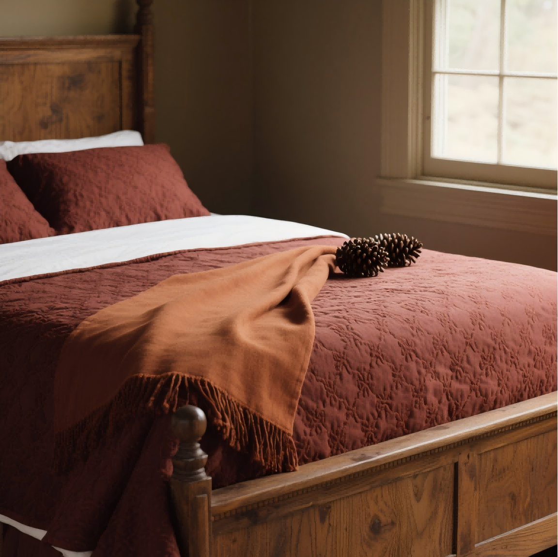
Color palette includes primary warm earth tones such as terracotta clay sage green olive moss burnt orange warm taupe charcoal with accents of sunrise peach muted gold deep navy or forest green for contrast. Follow the 60-30-10 rule 60% dominant earth tone 30% secondary 10% accent.
Material cues feature natural textures like wood grain matte ceramics stone cork sisal linen with finishes including brushed metals (old brass bronze) tactile matte coatings micro-textures evoking nature.
Form language uses organic rounded edges for approachable comforting feel with subtle asymmetry for handcrafted feel without losing polish.
-
Consumer Trends to Align With
Sustainability and longevity require emphasis on recycled or sustainably sourced materials repairability durability.
Wellbeing and calm aesthetics demand designs reducing visual noise offering warmth coziness.
Narrative and provenance need clear storytelling about material origins craft involved.
Functional warmth calls for features enhancing usability in colder months (insulation warmth-inclusive lighting tactile controls).
-
Product Preheating (Pre-launch) Tactics
Visual preheating involves releasing a mood board showcasing autumn earth tones textures lifestyle visuals using short clips or photography highlighting material detail tactile experience.
Messaging positions products as “seasonally warm” “crafted for autumn routines” or “earth-inspired innovation” crafting a narrative around comfort durability sustainable rituals.
Teasers and cadence follow a 4–6 week countdown with weekly reveals colorways material close-ups behind-the-scenes making feature previews.
Sampling and feedback share swatches or mockups with key communities (designers influencers early adopters) for qualitative feedback.
Digital touchpoints include a website landing page with immersive visuals 360° product views swatch pickers alongside AR/VR previews simulating material look in real environments.
-
Practical Design Guidance: Implementable Ideas
Colorway concepts are Concept A: Sage + Terracotta + Warm Brass accents Concept B: Moss + Sand + Brushed Graphite details Concept C: Olive + Clay + Navy accent.
Material strategy uses a dominant natural material with a contrasting but complementary secondary material (e.g., bamboo shell with ceramic insets).
Texture treatment incorporates light tactile texturing on surfaces to convey warmth (e.g., micro-engraved grain soft-touch coatings).
Lighting and ambiance (for products with illumination) use warm correlated color temperature (2700–3000K) to evoke autumn coziness.
Packaging uses recycled kraft soft-touch inserts earth-tone print finishes minimal plastic.
-
Competitive and Market Positioning
Benchmark involves analyzing 3–5 brands delivering autumn collections or earth-tone aesthetics.
Differentiation emphasizes sustainability story tactile materiality craft-led details.
Pricing psychology uses tiered options with a core earth-tone base premium finish variants.
-
Validation and Metrics
Design validation conducts quick A/B tests on colorways material finishes with target users.
Engagement metrics track social saves/shares on mood visuals time-on-page for the autumn landing email signup rate for launch updates.
Product readiness ensures supply chain can meet phased color/material options materials pass durability safety standards.
-
Quick Reference: Design Language Checklist
Color palette aligned to autumn earth tones
Material and texture palette defined (primary/secondary)
Form language and ergonomics finalized
Sustainability and provenance claims ready
Pre-launch content plan and cadence established
Packaging aligned with earth-tone and sustainability goals
Share the product category (e.g., consumer electronics home goods fashion furniture) target price point primary market any brand constraints (brand voice sustainability certifications required finish options) to get a tailored one-page mood board brief a 4-week pre-launch content calendar 3 specific color/material concepts for stakeholder presentation.